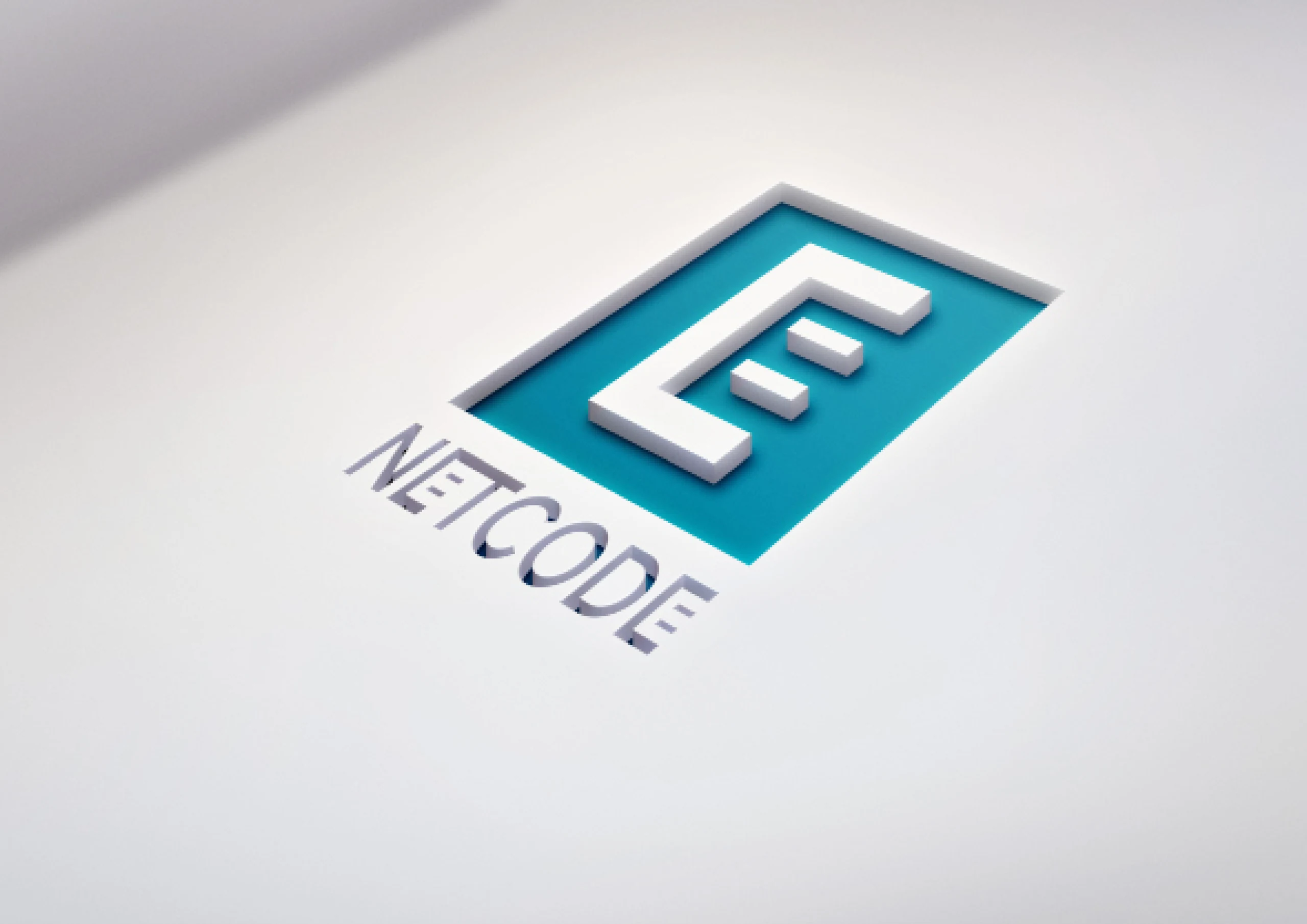
Visual identity of the technology company
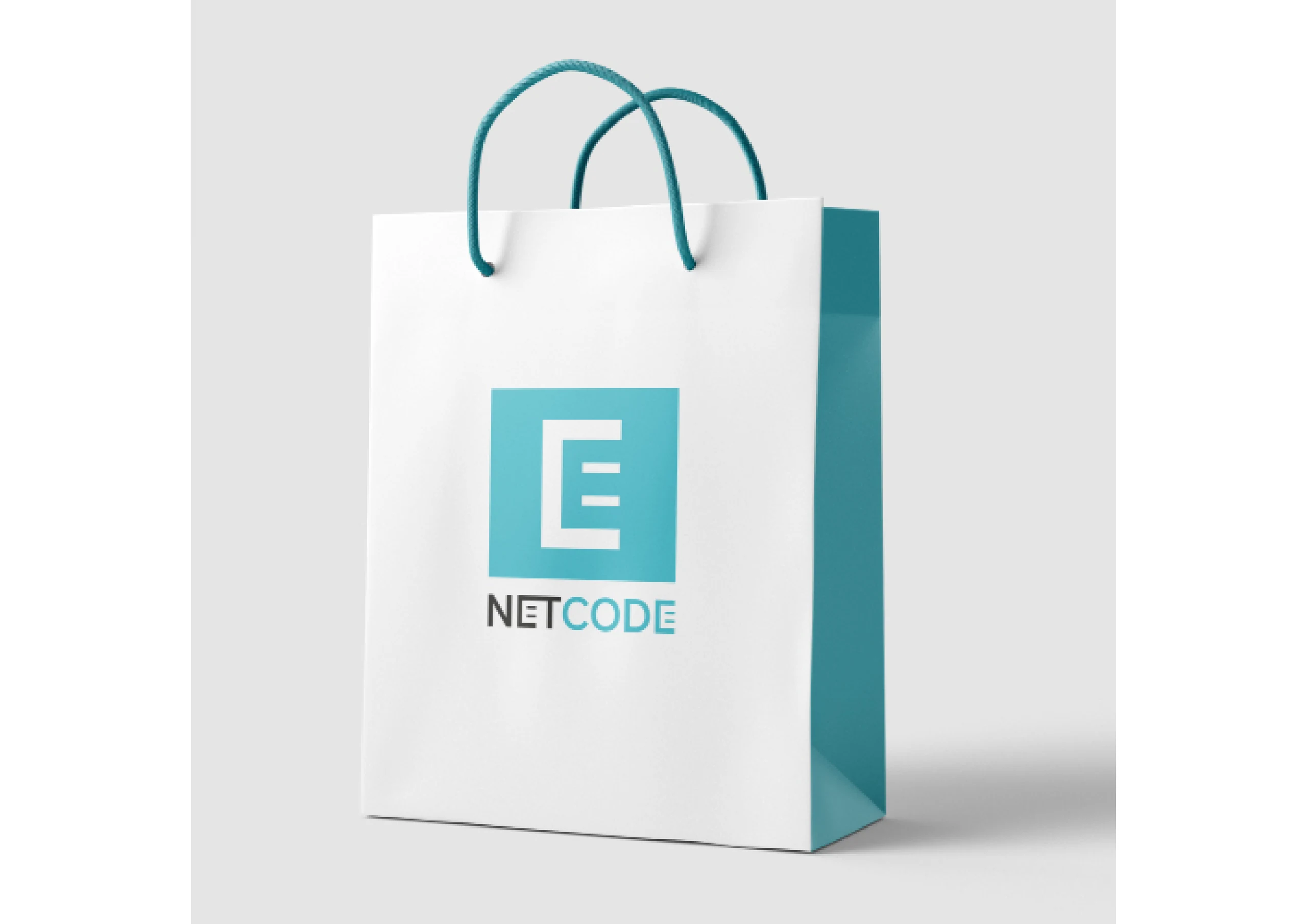
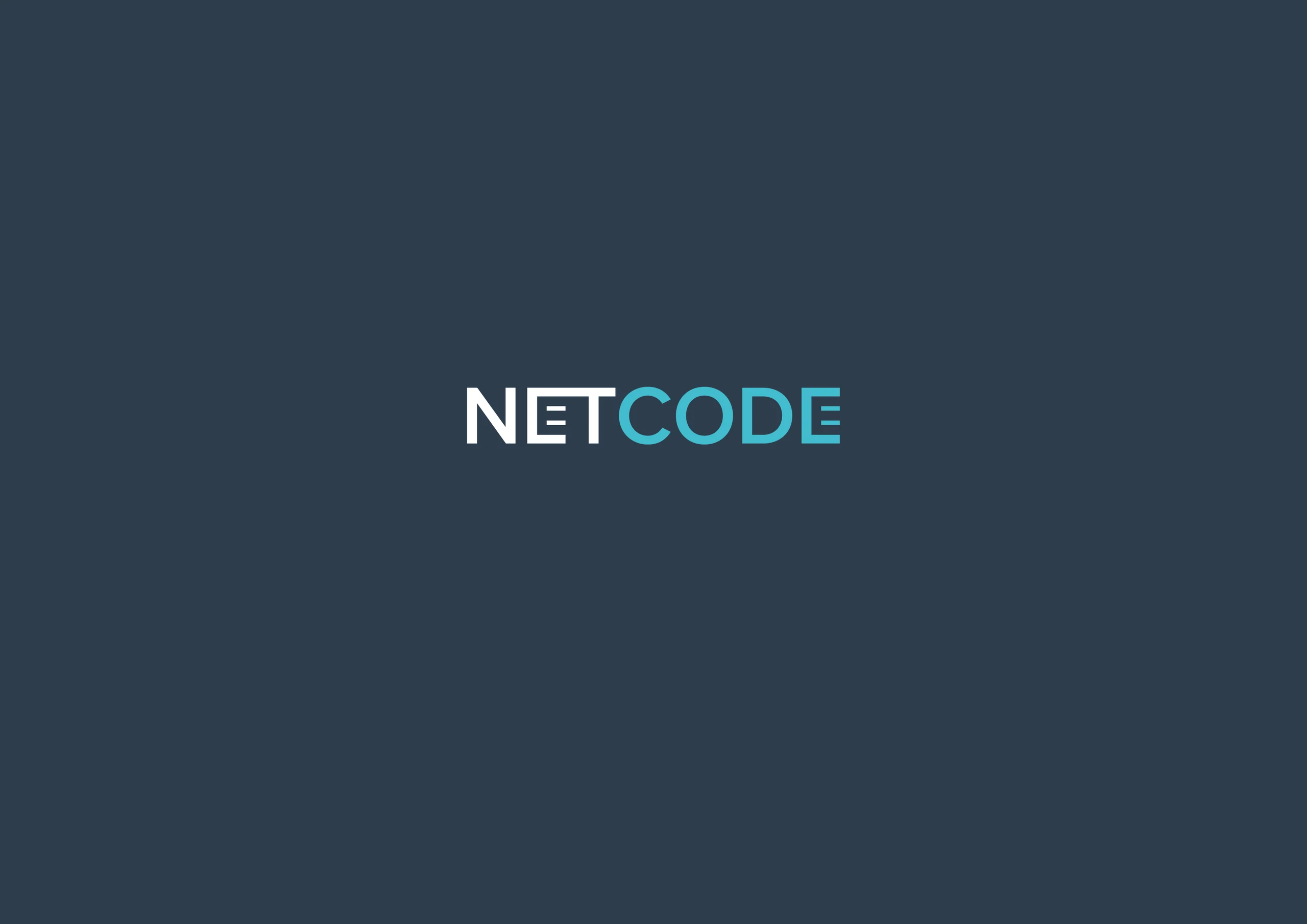
NetCode was a new Croatian company specialising in optical networks, telecommunications systems, and smart home systems, with founders boasting over 20 years of experience in the field. The visual identity had to be designed from scratch. The company's IT background inspired the logo, specifically the RJ-45 (or RJ45) connector, an 8-pin modular plug or socket used in structured cabling (e.g., for Ethernet purposes). The stylised shape of the connector was incorporated into the letter 'E,' making it the dominant feature of the logo rather than the first letter 'N.' The colours were discreet, featuring turquoise and dark blue, without strong contrasts. These colours were later implemented into the interfaces of their applications.
Thank you once again for your outstanding work and our successful cooperation. We happily recommend your services to others and look forward to future projects on which we could collaborate.